Artists' Books Part 2
- hannahcaprice
- Sep 6, 2018
- 3 min read
For my ‘simply bound’ book, I decided to continue playing with digital collage and merging imagery, but this time I wanted to incorporate paper cutting techniques to layer images, rather than split the pages to mix them.
We also had to incorporate ways of binding using stitch techniques to make book signatures (which are pages of the book folded in half and sewn together along the crease), and create hard covers using strawboard, buckram (book cloth) and a book press. I decided that I wanted to continue on with the ‘strange and absurd’ theme that I started with in my zine, but rather than merge images using the ‘mix and match’ design, I decided to create frames with images popping out from the sides and cut out all the negative spaces so when pages are layered, images from pages underneath peek through.
I drew inspiration from Kerry Miller’s and Alexander Korzer—Robinson’s book sculptures. Korzer-Robinson takes all the imagery from old books, cuts them out and arranges them in layers using the hollowed out book cover as a frame.
Here are some of his book sculptures....


...and Kerry Miller's.


I thought it could be possible to do something similar with digital collages, but using pages that could be turned to reveal new ways of layering images. I then decided to limit myself to 3 pages that mostly matched on both sides (ie have mirrored images on the front and back of each page), so that when the negative areas in the book pages were cut, they would line up and allow other images to peek through the open spaces. Here are the final book page images, ready to be printed. Now all I had to worry about was getting the mirrored images to line up on the back of these pages.


I discovered that lining up the images on both the front and back (ie, having a mirror-image that aligned on both sides), was very challenging indeed! After printing out all double-sided pages and looking at them through a light-box, I discovered that it was going to be impossible to line then up perfectly. My teacher, Jazminia Cininas, offered a brilliant suggestion - that I have a dominant side (with all of the imagery) and to try filling the opposite side with solid colour, perhaps leaving one or two images poking through. I then discovered a tool in Photoshop that allowed you to smudge colour (conveniently called the ‘smudge’ tool). This was a fairly decent option (as it would fill in the white 'negative' areas with colour), and the warping of the images further pushed the ‘surreal’ and strange theme emerging in the work.


When it came to sewing and binding the book, I discovered that the photo rag paper I used was much too thick, and I had printed the images with the grain direction going in the wrong direction for folding (although, given the paper stock I was using, I could only print on A3 landscape anyway, so I really limited myself there). The quality of the prints on the ‘good’ side of the paper were stunningly sharp, so in the end I’m glad I decided to use such fine paper (I used Somerset A3+, 300gsm - too thick, but beautiful for achieving sharp and luminous details). Here are a few images of the book. You can also view larger images under 'Latest Work'.


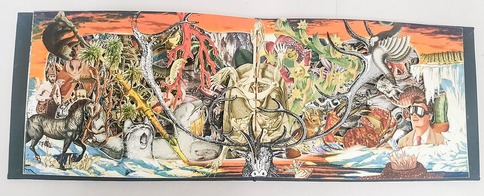

I decided to accept the outcome for what it was - not technically perfect, but not bad either. Time was running short and my wallet, thin, and I needed to just get it finished! The drawback in this book is that it does not lay flat, but on the plus side - when they are opened - the pages have slight gaps between them, giving the scenes depth and dimensional perspective. It may be worth taking these images and creating a tunnel book at some stage, or even a concertina, but the next step may be just getting those tiny technical details resolved first before making a ‘second state’.


Comments