Screen Printing
- hannahcaprice
- Nov 11, 2017
- 12 min read
Screen printing is perhaps a more familiar form of printmaking made popular by pop artist Andy Warhol in the 60s and commonly used to print commercial products (such as clothing) on a mass scale. It is, in fact, quite an old process developed during the Song Dynasty in China and later adapted in other Asian countries and Western Europe. The process is planographic; a fine mesh screen (traditionally silk, but now synthetic) is stretched and fixed onto a frame and ink is pushed through the screen onto a flat surface - typically paper or fabric. The screen is clamped to hinges affixed to a table, allowing it to open and close freely in between print runs. Paper or fabric is registered onto the table, stencils are used to block ink, and when the screen is dropped over the paper (in the 'closed' position), ink is pushed through the open apertures in the screen using a squeegee. Any areas blocked by the stencil will not receive ink.

Stencils can be made in a variety of ways, but for this project we focussed on the photographic process. A photosensitive, water-soluble emulsion is coated evenly on the screen and left to dry overnight. Once dry, the screen is sensitive to UV light and must be protected under non-UV emitting light. The emulsion will begin to cure and harden when exposed to UV light. Since it is water-soluble, areas that block out light - such as opaque stencils - will wash off. We were able to use cut-outs, photocopied transparencies and drawings on acetate using an opaque film marker as ways of creating our images. The images must be high contrast; if there are any grey areas, UV light is likely to harden, resulting in a patchy, uneven image. The transparency film or acetate with the design is secured onto the outer face of the screen with clear tape, and the screen is exposed to intense UV light in an 'exposure unit' room for about 1:35 minutes. Depending on how opaque the blocked-out areas are, a matter of seconds can make a difference to the quality of the image - particularly if it is drawn with an opaque film marker. These can sometimes draw translucent rather than opaque!
For this project, we were required to create three protest posters with a common theme. I slaved over ideas, trying to decide what I wanted to do and how I would approach the designs. I also realised that screen printing might allow me to experiment with visual effects in ways that other print processes would not. I'd been leafing through a book called 'The A-Z of Visual Ideas' by John Ingledew, and came upon an example where an artist used heat-sensitive ink. At room temperature the image is static. However, once it is exposed to a heat source, such as a hair dryer, parts of the image would either disappear or change colour. I took the holidays to do some further research on this before deciding upon my protest 'issue' and how I could suitably integrate this type of ink.

I found two websites with similar, but differently made, products. One company from the U.K. - SFXC - produces all kinds of heat and photosensitive inks, and seem quite reputable. They also appear to focus more on a commercial market, selling to shoe and clothing companies, but they sell to the general public on a small scale as well. Their products are prepared to be used 'out-of-the-box' and are a little pricey, so I just purchased a small bag of black disappearing ink. The second option was Solar Colour Dust from the U.S. They sell pigments at a fraction of the cost. This meant that I would have to figure out how to mix the pigments with acrylic binder and screen print paste to achieve the result I wanted. It also meant that it isn't opaque! I would have to do a bit of experimenting to get the results I wanted. I took the chance and decided upon five colours that I thought I could use for an idea that was already brewing.
After half a semester mulling over issues to protest, I decided upon revenge for female victims against powerful males - which was appropriate as the #metoo campaign and Weinstein/Spacey news around the web was bombarding our social media feeds. This issue is obviously nothing new. The same old stories - which never cease to be abhorrently shocking - have been around for centuries. So I decided to design artworks around stories and women that are literally centuries old.
After reading my eyes blind on the internet, I settled for three female characters who had fallen prey to three very powerful male figures in myth, legend and fairy tale. Medusa is probably the most familiar of the three, but how she became a gorgon (or that she even became a gorgon to begin with) is not common knowledge. According to Ovid, Medusa was originally a ravishingly beautiful priestess who served in the temple of the goddess Athena. Being a priestess, she had sworn an oath to chastity and carried out her duties as a loyal servant to the goddess. Her stunning beauty, however, would ultimately be her downfall. Poseidon, god of the sea, lusted after her so severely, he raped her in Athena's temple. Raping mortal women - and goddesses, for that matter - was normal and expected behaviour of powerful male gods. Medusa was blamed for being irresistibly beautiful, and Athena cursed her to become a horrible gorgon before exiling her. Part of the curse caused her gaze to turn onlookers to stone, which sadly forced her into a life of solitary confinement. Since her head could be used as a powerful weapon, many men ventured on quests to retrieve her head. None succeeded and all were turned to stone - all but Perseus. Perseus went on a quest to behead Medusa in order to save his mother from an undesirable marriage to King Polydectes. He begged the king to hold off on the marriage, and promised to retrieve Medusa's head in exchange for calling off the wedding. Perseus' quest is regarded as noble - indeed, he is rescuing his mother and, perhaps, 'relieving' Medusa from her misery. All the same, he does behead her - not to mention it was his idea.


The second female I chose is rather unfamiliar unless you know your history of saints. Saint Dymphna was a 7th century Irish princess with a pagan father, King Damon, and Christian mother. When Dymphna was 14 years old, she took a vow of chastity and consecrated herself to Christ. King Damon was deeply in love with her mother, and was inconsolable after her death. Sources say that his mental health declined sharply as a result, and he refused to remarry anyone unless they were as beautiful as his late wife. After a long and unsuccessful search, it dawned on King Damon that there was one young lady who matched her beauty - his daughter.
Dymphna would have been petrified at the proposal and she quickly escaped to Belgium with her confessor, Father Gerebernus. They took refuge in the town of Geel and opened up a hospice for the poor and sick, however the trail of Irish gold coins they left behind enabled the King to track them down. When the king tried to force his daughter to return home to marry him, she resisted. In his rage, he raised his sword beheaded her.

I hardly stumbled upon this story. It turns out that there are several European fairy tale versions floating around out there. In fact, there are so many it has its own classification number. There's a classification system for myths, legends and fairy tales known as the Aarne-Thompson-Uther classification system, and this one falls under AT-510B. The most popular version is known as Donkey Skin (however, there is also, Cat Skin, Cap'O'Rushes, The She Bear and several more). AT-510B is labeled 'Unnatural Love', but in most of the fairy tale versions the princess is rescued by a prince (surprise) and the father repents. Not so lucky for Saint Dymphna, but her legacy is celebrated in Geel where it is customary for people to open their homes to the mentally ill. They reside as 'boarders', rather than patients, and are cared for as member of the family. You can read more about Geel's fascinating history here.


The last victim I chose comes from Russian folklore and is a recurring character in Slavic fairy tales. The firebird is often regarded as a glowing, colourful, enchanted bird and is the catalyst for many quests in Russian fairy tales. Her feathers are coveted for their magical properties, and the bird is also treasured for its beauty and magic. A lesser known fairy tale, perhaps, is the origin of the firebird. There was once a young and gentle maiden named Maryushka who resided in a small village. No one could embroider as beautifully as she. People came from far and wide to purchase her work, and she would often allow the less fortunate to pay later if they hadn't the means to pay upfront. Koschei the Deathless, an evil sorcerer (also a common character in Slavic fairy tales) had learned of her skills and was consumed with jealousy. He decided that he must have her all to himself, so he transformed into a young and handsome prince and paid Maryushka a visit. He stopped at her house to look at her embroidery and was secretly furious to discover how much better she was at the handiwork than him. He requested her hand in marriage and promised her jewels, riches and a life of luxury; the only condition was that she must embroider for him alone. Maryushka was dismayed and told Koschei she could never leave the hometown she loved so dearly. In his rage, he cursed Maryushka and turned her into a firebird. He then transformed into a falcon, snatched her in his talons and carried her away. As he was flying, her feathers dropped to the ground below. As the last feather fell, she died.


All three stories are quite dramatic, and both Medusa and the Firebird have magical attributes so I wanted to somehow convey this in the screen prints. I did not have anything figured out right away, that is for sure! I had the intention to convey 'magic' in the back of my mind, but was more focussed on how I was going to create the design and layers. This alone took up all my mental energy since I had never worked with layers before! I began with Medusa and decided I would collage the image together. Since I was lacking quite a bit of confidence in the beginning, I decided I had to take the plunge immediately.
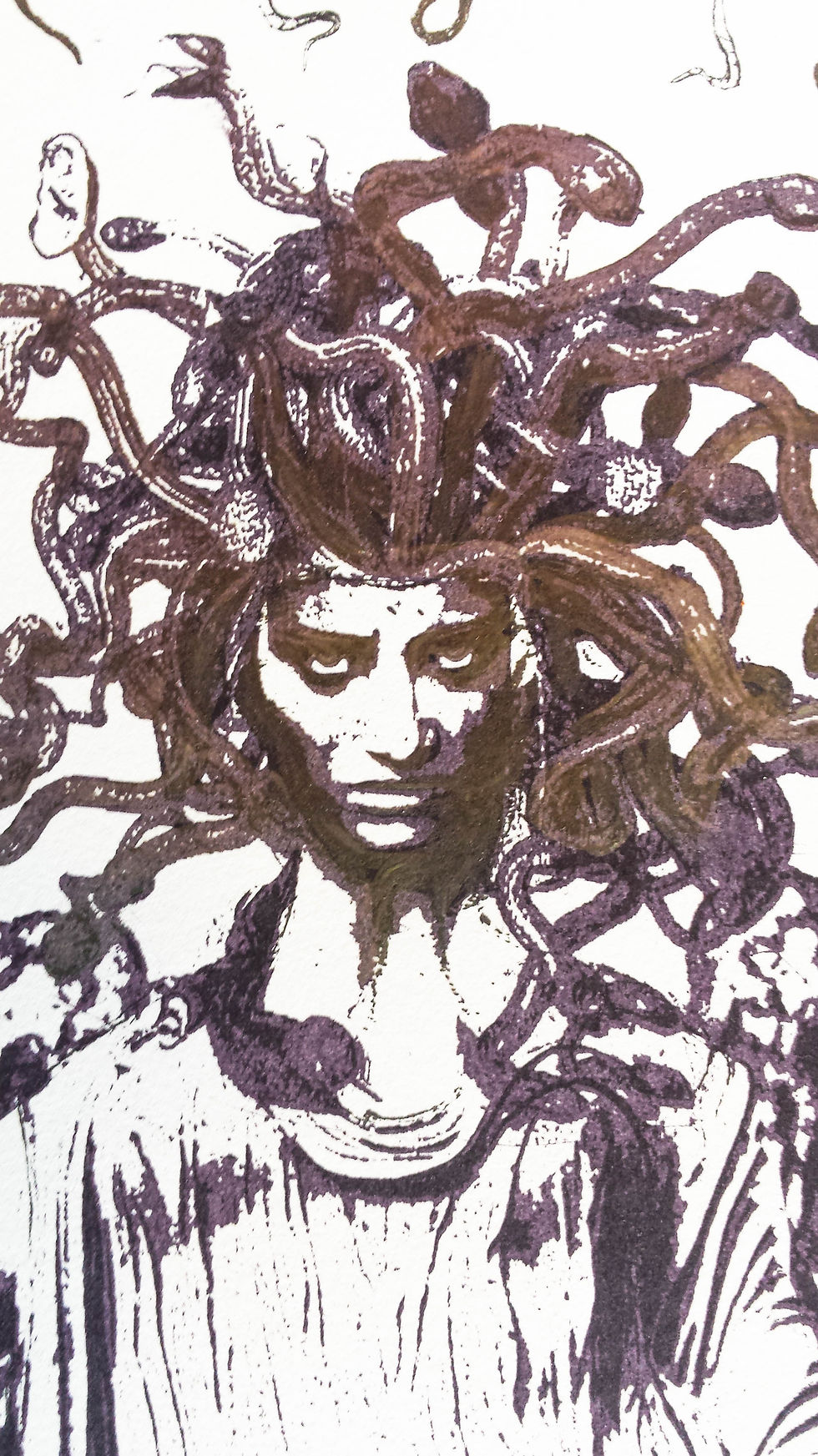
I started by collaging a black and white image of Medusa together. I sourced several photos from the internet - mostly from ancient Greek statues - and I collected images of snakes and found a costume headdress of snakes as well. I had the basic equipment to print transparencies at home, so I printed out the images, cut them up, collaged them together and went off to expose my first image. Here are a few of the unassembled images I used.

I was rather disappointed with the first print - it hadn't developed the way I had intended. It was patchy and pale in areas that should have been bold and dark. Instead of dwelling in my disappointment, I thought that adding colour could enhance it to the desired result. I photocopied the design, increased the contrast in Photoshop and printed it out on A3 transparency. I re-exposed the image and attempted to fill in the lost details with a bloody burgundy and purple blend. It was a bit dark, but satisfactory.

I noticed that the area around Medusa's feet looked rather thin, so to resolve this I would need to colour the whole image. I repeated the process by enhancing the contrast of the snakes, and then used an opaque marker to draw blood dripping from the text. I was happy with the final result, but Medusa needed that element of magic.

I had discovered a clear, heat-sensitive top coat called 'liquid crystal', and thought I would give this a try. It spreads on quite thinly and dries completely clear, but once it is coated on a dark surface heat will cause it to glow in a range of colours, including red, green, blue and purple. It is much more sensitive than the pigments - only a slight change in heat will cause it to glow. I thought it would be appropriate for Medusa's head to convey her pain, fury and power to turn onlookers to stone.


Now that I had worked up sufficient confidence, I decided to try the CMYK photographic process with Saint Dymphna. Any colour photograph can be manipulated and screen printed by using a colour separation technique. The photo is first imported into Photoshop and using a few tools, colour-halftone and resolution are adjusted so that the screen can evenly layer the colours - CMYK (cyan, magenta, yellow and black) or RGB (red, green, blue), . Next, the colours are separated into the three or four main layers. You'll notice that your printer cartridges fall into these categories, so it is essentially the same thing. Once all four images have been generated, they are ready to be printed in black on transparency film.
Since I intended to use a single image for this poster, I decided to make a collage. I collected numerous images from the internet. The central image is Saint Dymphna looking down at a past event - her father's proposal; the tiny image just above her is of him raising his sword above her, and the image in front of her robe is that of Donkeyskin, covering her face with one hand. Medieval days were strange days, so I was able to find several sinister images of a crowned female beheading a crowned male. I later learned that this is Judith beheading Holofernes - another thrilling tale from the Bible where justice for a woman is so aptly served. And I'm not being ironic, either. Judith used her sexual charm to gain entry into Holofernes' chamber. Holofernes had plans to destroy her town, but while he lay in bed in a drunken heap, Judith swiped his sword and beheaded him. I thought the 'eye for en eye' imagery was appropriate as I had already used it for Medusa, so I collected and collaged these images, scanned them, added a layer of paint to unify the border around Dymphna and scanned the final work.


This process does not produce a crisp photographic image - that is designated to the realm of photography. Rather, the results are vivid and textured, producing a bold, painterly image. Several factors affect the result of the print, including the screen resolution, consistency and ratios of the ink and pressure of the squeegee. This poster had initially printed much lighter than I had anticipated, and I had to reprint the black layer as I had lost so much detail in the first run. I was beginning to understand how temperamental screen printing is, but I was intrigued by the results and was starting to have some fun.


Last, and certainly not least, I started planning the design for the firebird. The first thing I needed was an appropriate design to adapt and transform into something a little more angry. The firebird has very distinct traits. It looks somewhat like a peacock with large eyes on its tail feathers, but it is 'firey' and dramatic, and it is often depicted as trying to flee from its captor (normally Ivan Tsarevitch holding a prized feather). I found one image that I thought was quite suitable, and decided to rework it into something new. I printed out the image in large format, and then traced the outline in black pen. I also repositioned one of the wings and bent the bird's head downwards to scream at Koschei. As for Koschei, I scoured the internet to find an image of a frightened skeleton. I thought the one I found was suitable, particularly since both the bird and skeleton were arranged to appear as though they were looking straight at each other.

The next thing I needed to figure out was how I was going to colour the bird! I had a black and white outline that needed filling in, so I opted for colouring in the bird with five layers of acetate. I created a colour-guide by printing out an A4-sized black and white copy of the bird and simply colouring it in. While this was, indeed, simple, it was also quite time-consuming. Even more time-consuming was colouring the five layers of acetate. This took at least three and a half hours, but was nevertheless a calming activity.


Lastly, and most importantly, I had to figure out how I was going to mix my pigments into a screen printing medium. The screen print paste we were using is intended for acrylic paint, and acrylic paint already comes prepared with a binder. I did a little internet searching and asked a few people at the art shops for advice. I decided to take a chance on an acrylic binder made by Matisse (which is also the same brand of screen print paste we were using). I chose this for its complete transparency as some binders contain (I think) calcium carbonate to increase opacity of the pigments. It also happened to be cheap and very effective, so I'm glad it was the one and only binder I had to buy!
I mixed a teaspoon and a half of pigment with 1 ounce of binder. It took a little patience but mixed thoroughly well. I then transferred the mixture to a small tub and stirred in the screen print paste. I did a few experimental prints and was quite happy to see that it behaved like normal screen printing paste - except that it was a little too transparent. I resolved this by doing 2-3 passes per layer, allowed the ink to dry, re-registered it, and printed a second layer over the existing colour. This results were much bolder which enhanced the vivid colour-change I was aiming for in the poster.
I then realised that I needed to make a body for Koschei's skeleton. I affixed a piece of acetate over the skeleton in one of the posters and drew a petrified sorcerer with the opaque marker. I had to hide the entire skeleton but also ensure it blended into the illustration of his body. Since this is an evil antagonist who is draped in a black robe, this wasn't so difficult to do.
I was quite satisfied by the end of this project - mostly because I found a way to have fun with the process, and also because I learned a lot about these old and obscure characters that, sadly, reflect a part of our humanity that hasn't changed much. These stories are part of our everyday reality; they're being rehashed and retold in new ways, and perhaps social media will be a catalyst for changing these harmful attitudes. It's nothing less than deplorable that news of violence, rape and assault against women is still surfacing. There is power behind a story when someone is listening, but showing that we are listening also means changing our attitudes and behaviour. It's about action and doing something, and working thoughtfully and deliberately about what that 'something' is.


Comments